Popups
Popups are an effective way to communicate important information, display promotional content, or collect user data on your website. They are based on Bricks Templates, which you can use to create your popups.
Important: Please note that as of Bricks Version 1.6, the Popups feature has a native integration, and it is no longer necessary to use the Bricksforge version. However, the Bricksforge Popups will remain in the code base and continue to work for users who prefer it.
How to use
Create a Template
First, you need to create a Template. You can do this by going to the Templates section of the Bricks Builder and clicking on the Add New button. As Template Type, you can choose Section.
Now, you can design your popup. You can use any Bricks element you want.
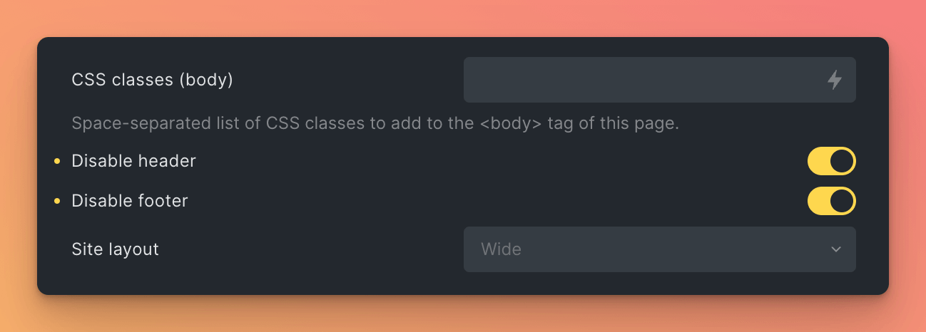
Disable Header & Footer
Then, you can disable the Header and Footer of the Template. This is necessary, because by default, the template will display the header and footer of the page. You can do this by clicking Settings (Icon) > Page Settings > General > Disable Header / Disable Footer.

Now you have the basic template for your popup.
Create Popup
Now, you can create a popup. You can do this by navigating to Bricksforge > Popups and clicking on the Create Your First Popup button. This will add a new accordion item to the list of popups.

The Accordion Header shows the name of the popup and the current status. The status defaults to Inactive, which means that the popup will not be displayed on the website.
For each popup, you can set the following options:
| Setting | Description |
|---|---|
| Status | The status of the popup. If checked, the popup will be displayed on the website and the status will be Active. If unchecked, the popup will not be displayed on the website and the status will be Inactive. |
| Name | The name of the popup. This is only used for internal purposes and will not be displayed on the website. |
| Template | The template that will be used for the popup. You can choose between all the templates you have created. |
| Display On | Where should the popup be displayed? You can choose between: • Entire Website - The popup will be displayed on all pages of the website.• Specific Post/Page - The popup will be displayed on a specific page or post. You can choose between all the pages and posts you have created. |
| Page | The page or post on which the popup should be displayed. This setting is only visible if you have chosen Specific Post/Page in the Display On setting. |
| On (Trigger) | When should the popup be displayed? You can choose between: • Page Load - The popup will be displayed when the page is loaded.• Click - The popup will be displayed when the user clicks on a specific element. You can enter a CSS selector for the element.• Scroll Position - The popup will be displayed when the user scrolls to a specific position.• Custom Trigger - The popup will be displayed using the Bricksforge Element “Popup Trigger”. You can add this element to your page and configure it to display or close the popup. |
| After | The time after which the popup should be displayed. This setting is only visible if you have chosen Page Load in the On (Trigger) setting. |
| How many executions? | The number of times the popup should be displayed. This setting is only visible if you have chosen Page Load in the On (Trigger) setting. |
| Selector | The CSS selector of the element on which the popup should be displayed. This setting is only visible if you have chosen Click in the On (Trigger) setting. Example: #my-button |
| Animation | The animation that should be used to display the popup. You can choose between: • Fade In Down - The popup will fade in from the top.• Fade In Up - The popup will fade in from the bottom.• Fade In Left - The popup will fade in from the right.• Fade In Right - The popup will fade in from the left.• Fade In - The popup will fade in. |
| Overlay Color | The color of the overlay. This is the color that will be displayed behind the popup. |
| Inner BG Color | The background color of the popup itself |
| Close on overlay click | If checked, the popup will be closed when the user clicks on the overlay. |
| Add Close Button | If checked, a close button will be added to the popup. You could add a custom close button using the Bricksforge Element “Popup Trigger” as well. |
| Is Scrollable | If checked, the popup will be scrollable. This is useful if the popup is very large and does not fit on the screen and will improve the user experience. |