Pro Forms Steps
This element is a part of the Pro Forms element. It is used to sync multi step navigation with a form. Using this element you have more control over the step navigation. You can place it anywhere on the page and style it as you like.
Connection

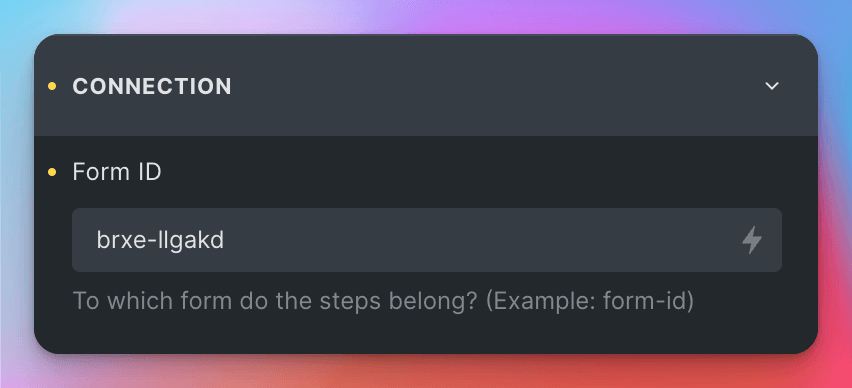
To connect the element to a form, you need to enter the form id to the Connection > Form ID control.
The ID should have the following format: brxe-djfkd.
Once you’ve connected your element to the form, the frontend will automatically display the correct step naviation. You can customize the navigation by using the controls in the group Step Settings.
Step Settings
| Setting | Description |
|---|---|
| First Step Text | The text to display on the first step. Default: “Start” |
| Step Typography | The typography settings for the step text. |
| Current Step Typography | The typography settings for the current step text. |
| Step Background Color | The background color of the step. |
| Current Step Background Color | The background color of the current step. |
| Step Width | The width of the step. |
| Step Padding | The padding of the step. |
| Flex Direction | The direction of the flex items. (Vertical, Horizontal, Reverse) |
| Justify Content | The alignment of the flex items. (Flex Start, Flex End, Center, Space Between, Space Around, Space Evenly) |
| Align Items | The alignment of the flex items on the cross-axis. (Flex Start, Center, Flex End, Stretch) |
| Gap | The gap between the flex items. |
| Allow Clicks on Steps | If enabled, the user can click on the steps to navigate to them. |
| Step Transition | The transition to use when navigating to a step. Default: “all 150ms linear” |