Animation Controls
Create stunning GSAP animations inside the Builder.
Note: For really complex animation timelines using GSAP, it’s recommended to use the Bricksforge Panel extension.
Activate
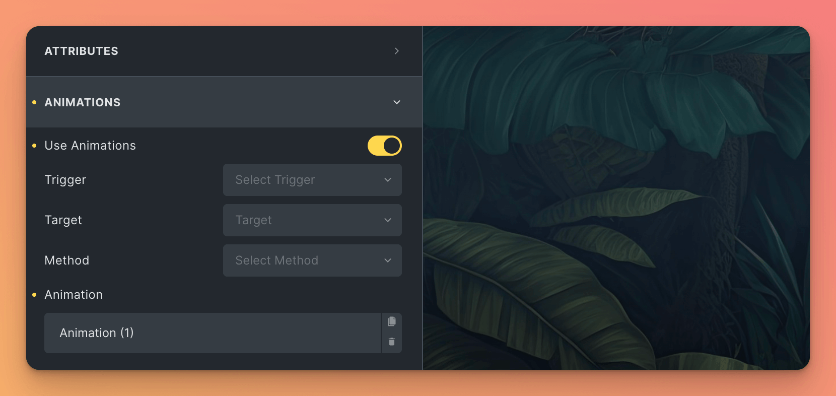
Activating the extension, you’ll see a new group in the Builder Style Tab called Animations. This tab will be available for all elements.

Inside this group, you’ll find different controls to create and manage your animations.
Creating Animations
To create an animation, you’ll need to select an element, change to the Style tab and open the control group called Animations.
General Settings
Now, you can setup the animation using the following controls:
-
Use Animations: Enable or disable the animation for the selected element.
-
Trigger: Select the trigger that will start the animation. You can choose between:
Enter ViewportThe animation will start when the element enters the viewport.ClickThe animation will start when the user clicks the element.HoverThe animation will start when the user hovers the element.
-
Target: If the Trigger is set to
ClickorHover, you can select the element that will trigger the animation. You can choose between:This ElementThe animation will start when the user clicks or hovers the selected element.Other ElementThe animation will start when the user clicks or hovers another element. If you choose this option, you’ll see a new control Custom Selector, where you can select the element using a CSS selector.
-
Method: Select the animation method. You can choose between:
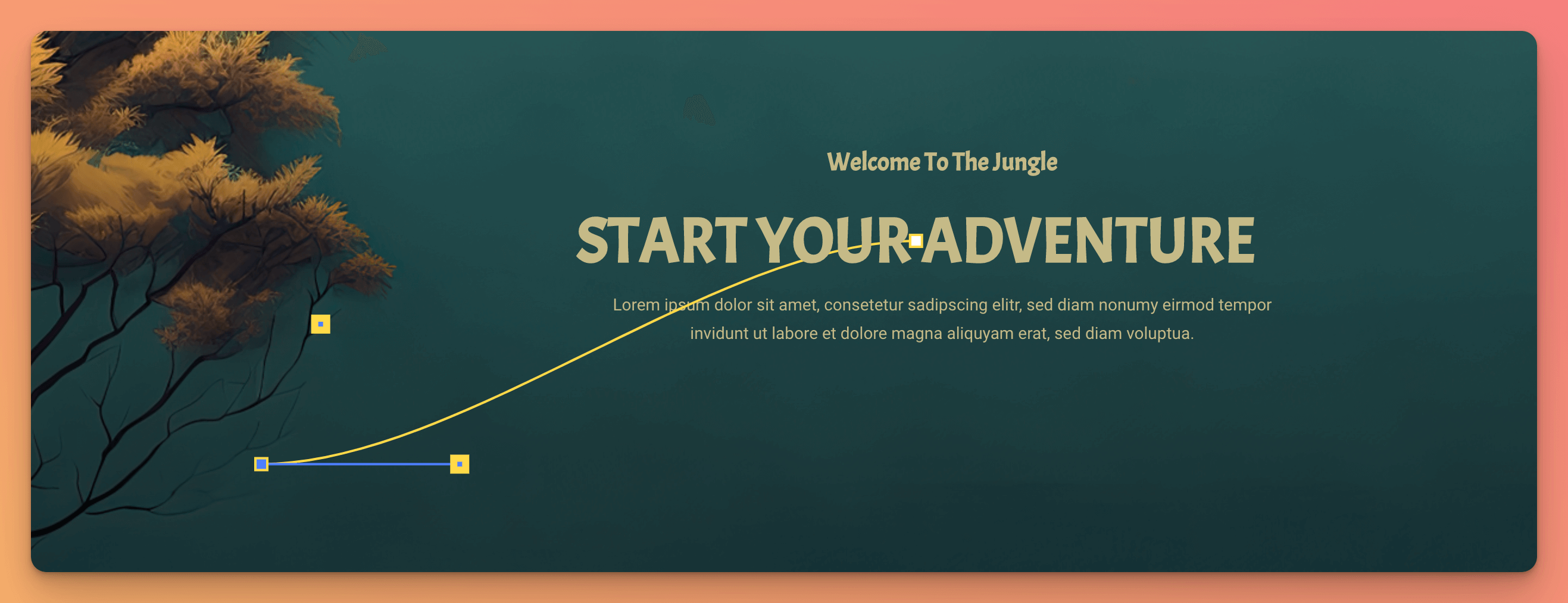
FromThe animation will start from a new state to the current state.ToThe animation will start from the current state to a new state.From ToThe animation will start from a new state to another new state.Motion PathThe animation will follow a motion path which you can draw using the Motion Path Helper.
-
Animation: A repeater field to add multiple animations using native Bricks controls. You can add as many animations as you want. Each animation will be applied to the selected element.
-
Transform: Select the transform property that will be animated.
-
Filters: Select the filter property that will be animated.
-
Custom: Create a custom GSAP animation object. You can use the GSAP documentation to learn more about how to create such objects.
Example:
{
    opacity: 0.7,
    x: 200,
    y: 50,
    color: "#FFFFFF"
}
-
-
Duration: The duration of the animation in seconds.
-
Delay: The delay before the animation starts in seconds.
-
**Disable from breakpoint: ** Disable the animation for the selected breakpoint and below.
-
Render Changes: Render the changes in the preview after you’ve made any changes.
Note: Multiple repeater fields are created as a timeline. So you can play several animations one after the other. (Only supported for
Click&Hovertrigger)
Enter Viewport Settings
If the Trigger is set to Enter Viewport, you can setup the following controls:
- Start Position: The ScrollTrigger Start Position. This means the position where the animation will start. Default:
top bottom(The animation will start when the top of the element hits the bottom of the viewport). - End Position: The ScrollTrigger End Position. This means the position where the animation will end. Default:
bottom top(The animation will end when the bottom of the element hits the top of the viewport). - Scrub: Enable or disable the scrub feature. If enabled, the animation will be scrubbed when the user scrolls the page. Scrubbing means that the animation will be played in real-time while the user scrolls the page. Default:
false. - Show Markers: Enable or disable the markers. If enabled, you’ll see markers in the preview to see the start and end position of the animation (For development). Default:
false.
Motion Path Settings
If the Method is set to Motion Path, you can setup the following controls:
- SVG Path: The SVG path that will be used for the motion path animation. You can use the Motion Path Helper to create a new path visually.
- Use Motion Path Helper: Enable or disable the Motion Path Helper. If enabled, you’ll see a visual SVG Path which you can use to create a new path. Once you’ve created a new path, you can copy the SVG path clicking Copy Motion Path and paste it into the SVG Path control.

- Auto Rotate: Enable or disable the auto rotation. If enabled, the element will be rotated automatically to follow the motion path. Default:
false. - Ignore Parent Dimensions: Enable or disable the ignore parent dimensions. If enabled, the motion path will be calculated without the parent dimensions. Default:
false. - Set Position to absolute: Enable or disable the set position to absolute. If enabled, the position of the element will be set to
absolute. Default:false.
Note: The Motion Path Helper is based on the GSAP Motion Path Helper. You can read the documentation to learn more about how to use it.
Troubleshooting
My animations are not working in the front-end
If you’re using the Bricks setting Add Element ID & Class As Needed and you’re having trouble triggering your animations in the front-end, it may be because you need to assign a unique ID to your elements. The reason for this is that the Add Element ID & Class As Needed setting doesn’t give an ID to elements unless it’s necessary, which is a great improvement in terms of performance. However, if you want to add animations to your elements, they must be selectable from GSAP. Therefore, you may need to assign a unique ID to your element to ensure that it can be easily targeted and animated in the front-end.